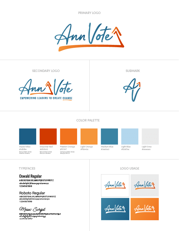
Insights into Logo and Brand Usage
Your logo is the visual cornerstone of your brand. It’s what people first see when they view your website, social media profiles, print material, and products. Learning how to consistently and thoughtfully use your logo will help in building a strong brand presence and leave others wondering how you're doing it. If you learn anything from this article, it's that a great logo is only as effective as its application.

Think of your logo not as one static image, but as a flexible system designed to best represent your brand in any situation. The more variations you have of your logo, the more possibility there is to push the creativity of your brand. This guide walks you through how to use your different logo variations to build an easily recognizable brand identity. (ex: think of how the bitten apple of Apple and the golden arches of McDonald's bring instant brand recognition) We’ll break down the information provided in your style guide plus some extra tips to give you the confidence to use your branding like a pro.

Introduction to Brand Identity
Your brand identity is how your business connects with the world around you. It's far more than just a logo; it's the complete collection of visual and emotional touchpoints (your colors, tone of voice, purposeful messaging, user experience, etc.) that come together to define and tell your brand story.
If you want to create a cohesive brand image that truly represents your vision, it's essential to first establish clear logo usage guidelines and comprehensive brand standards that work specifically for your business. These tailored guidelines ensure that every element of your branding—from your marketing materials to your digital platforms—stays consistent, authentic, and true to your company's core values. By developing and implementing these personalized guidelines, your business can prevent confusion and misuse of your brand assets, supporting powerful branding efforts that drive sustainable growth and long-term success.
Understanding Logo Design
Your logo is the face of your brand, serving as a powerful representation of your company's mission, values, and unique personality. A strategically-crafted logo should be simple enough for instant recognition, yet distinctive enough to symbolize your brand's competitive edge. It should perform seamlessly and be able to connect with your audience across diverse applications, from digital screens and social media to product packaging and print material.

When developing a logo, your business must embrace key design elements such as color specifications, typography guidelines, and minimum digital size requirements that simplify, strengthen, and succeed. These strategic factors ensure that your visual identity remains clear and impactful, no matter where it appears. By understanding the principles of effective logo design through custom strategies rather than templates, you can create a powerful visual representation that communicates your brand's authentic identity and resonates deeply with your target audience, building lasting connections that help your business thrive in today's competitive landscape.
Understanding your brand guidelines is the key to protecting your brand's most vital asset, your logo.
Understanding Your Logo Variations
A complete brand identity includes several versions of your logo, each designed for a specific purpose. Knowing when and how to use each one is the first step toward brand consistency.
Your primary logo is exactly as it sounds—primary. It's often the most detailed version among your logo suite, and t’s your go-to for most situations where you have enough space to make a clear impression.
- Best for: Website headers, professional proposals, letterheads, and primary business signage.
- How to use it: Think of this as the default version. This is your standard logo and serves as the main representation of your brand. Use it whenever possible, as long as it remains legible and isn’t compromised by a busy background or a cramped layout. It should be the most frequently seen version of your logo to build strong brand recall.
A secondary logo is an alternate version, often a stacked or simplified version of the primary. It’s designed to fit into spaces where the primary logo would be too wide, too tall, or too complex.
- Best for: Narrow website footers, email signatures, social media banners, or vertical ad formats.
- Example: If your primary logo is a wide, horizontal design, a stacked secondary logo provides a more compact option that maintains readability in tighter, square-ish spaces. Adapting the company's logo for various applications ensures consistent brand recognition and visual identity across both digital and print formats. It’s about adapting to the environment without sacrificing brand identity.
The submark (or brand mark) is the most simplified of your logo system and is often used for extremely small applications where the full logo would be illegible. It’s typically an icon, monogram, or a single graphic element extracted from the main logo.
- Best for: Social media profile pictures, website favicons, watermarks on images, hats or other apparel, or as a repeating pattern element in your branding.
- How to use it: A submark ensures your brand is still recognizable even at a tiny scale. Avoid using it in place of the primary logo when you have ample room or until you have built of enough brand recognition; its power lies in its ability to maintain presence in small-scale applications.
Effective Logo Application
Beyond choosing the right variation, following a few core principles will ensure your logo always looks its best. These are foundational elements of any brand style guide. An important aspect of effective logo usage is adhering to specific guidelines for colors, size, typography, and spacing—each guideline helps maintain brand consistency and visual coherence across all platforms.
The Importance of Logo Clear Space
Clear space, or padding, is the protected area around your logo. This invisible buffer ensures that other graphics, text, or page elements don’t clutter or compete with your logo. All other visual elements should be kept outside the clear space to maintain the logo's legibility and prominence.
- A good rule of thumb: The required clear space is often determined by a key measurement within the logo itself, like the height of a specific letter or the width of an icon. Maintaining this space allows your logo to “breathe” and stand out, preserving its visual impact and integrity.
Finding the Minimum Logo Size
Every logo has a size limit. Below a certain point, it becomes blurry, unreadable, and unprofessional. To ensure visibility, always adhere to minimum size requirements so your logo remains clear and recognizable across all uses. Your guidelines should specify the minimum size for both digital and print applications.
- For digital: A common minimum width for a primary logo is around 200 pixels. Submarks can often go much smaller for favicons.
- For print: A primary logo should generally not be printed smaller than 1.25 inches wide to ensure legibility.
- The test: Before finalizing a design, always shrink your logo to its intended minimum size on screen or in a print proof. If any part of it is difficult to read, it’s too small.
Choosing Logo Color Variations
Your brand identity includes a defined color palette, and your logo should adapt to it. It’s important to use your brand colors consistently in logo variations to reinforce recognition and professionalism. You will typically have a few pre-approved color versions to work with.
- Full-Color: This is your primary color version. Use it on light, neutral backgrounds (like white or light gray) where it can stand out.
- White (or Knockout): This version is essential for use on dark backgrounds, brand-colored fields, or busy photographs. It ensures your logo remains visible and legible by “knocking out” the background color.
- Single-Color: A black or other single brand color version is perfect for limited-color applications, such as documents printed in grayscale, embroidery, or embossing.
How to Handle Backgrounds
Never place your logo on a background that compromises its readability. Cover logo placement is crucial for maintaining brand integrity across different media, ensuring consistent positioning, sizing, and clear space around the logo. Avoid busy patterns, clashing colors, or photographs where the logo gets lost. If you must place it over a complex image, use a solid-color field behind it or apply a subtle overlay to the image to increase contrast.
The Don’ts of Logo Usage
Just as important as knowing what to do is knowing what not to do. Clear do's and don'ts help prevent common mistakes in logo usage, ensuring your brand is always represented consistently and professionally. To protect your brand’s integrity, never alter your logo in the following ways:

Understanding Logo File Formats
You will receive a folder of logo files, and choosing the right one is crucial for quality. Different formats are optimized for different uses.
- For Print (Vector): AI, EPS, PDF. Vector files are built with mathematical equations, meaning they can be scaled to any size—from a business card to a billboard—without losing quality. Always use these for professional printing.
- For Digital (Raster & Vector): SVG, PNG, JPG.
- SVG: A vector format for web use. It’s scalable and offers crisp results on any screen, making it the best choice for web logos.
- PNG: A raster format that supports transparency. Use it when you need to place your logo over a colored background or image on your website.
- JPG: A raster format that does not support transparency. It’s best used for photographs, not logos, unless the logo is on a solid white background.
Advanced Considerations for Your Logo
Accessibility and Contrast
On digital platforms, your logo should be accessible to everyone, including those with visual impairments. A key factor is the contrast ratio between your logo’s color and the background color. Aim for a contrast ratio of at least 4.5:1 to ensure it is legible for most users.
Consistency in Placement
Develop a consistent approach to logo placement across your marketing materials. For example, you might always place it in the top-left corner of your website headers or centered at the bottom of your presentations. This repetition helps build brand recognition and creates a more professional, cohesive experience for your audience.
Co-Branding with Partners
When your logo appears alongside another company’s logo, it’s called co-branding. In co-branding partnerships, it’s important to follow guidelines for using two logos, including proper placement and spacing, to maintain brand integrity and ensure visual harmony. The goal is to present both brands as equal partners. To achieve this, ensure the logos have similar visual weight and are aligned properly (e.g., by their baselines or center points). Use a thin vertical line and equal clear space to separate them cleanly.
Your logo is a powerful tool for building a lasting connection with your community. By following these logo usage guidelines, you empower your brand to show up consistently and professionally everywhere it appears. If you ever feel unsure or need help applying your brand identity, our team is here to guide you. Contact us today for support with your branding and digital marketing needs.

Creating Brand Guidelines
Brand guidelines, or brand style guides, are your strategic partners for growth, empowering businesses to maintain consistency that simplifies, streamlines, and succeeds across all branding efforts. These comprehensive tools deliver clear, results-driven standards for logo placement, usage, and variations, while establishing tailored rules for color palettes, typography, and tone of voice. Effective brand guidelines also address co-branding scenarios, digital applications, and print implementations, ensuring your brand thrives with accurate representation across every touchpoint in your community and beyond. By developing brand guidelines, companies can boost recognition and trust with their audience, protect their brand's integrity, and optimize collaboration among team members.
The most successful brand guidelines combine accessibility with expertise—easily navigable, concise, and regularly updated to reflect evolving branding strategies or visual identity changes. This empowers everyone—from designers to partners—to confidently apply your brand assets through custom strategies, not templates, supporting your unique branding goals and engaging your audience with consistency that drives real results.
Managing Brand Assets
Managing your brand assets is your pathway to consistency and professionalism that drives real growth in your branding efforts. This empowering process involves organizing, storing, and updating all your brand-related files—including logos, images, videos, and documents—so they're easily accessible to your authorized team members like graphic designers and marketers, creating opportunities for seamless collaboration and success.
To achieve lasting consistency, your business should establish clear, results-driven guidelines for logo usage, including practical do's and don'ts, while ensuring all your assets stay current and aligned with your latest brand standards. Leveraging digital asset management platforms streamlines this journey, making it simpler to share, update, and control access to your brand assets across different teams and platforms. By managing your brand assets with expertise and intention, you reduce costly errors, support cohesive branding that resonates, and empower your team to represent your brand with confidence, clarity, and the professional edge that helps your business thrive.
Frequently Asked Questions

Let's Create Your
Business Success Blueprint
Create a Digital Marketing Strategy and Plan for your Brand
The team at Redwood Valley Technical Solutions can help you accelerate your business online.


