You’ve put a lot of effort into creating a top-notch landing page for your latest campaign. Now you’re ready to add a form to collect all those leads. Yay!
We’re here to remind you that form layout is an important element of the form design. As a website manager you might be thinking, “What does that mean?” In this article, we will explore 7 tips for optimizing your form layout, making it a user-friendly, lead collecting machine.
1. Make the Form Flow
Make your form flow as smoothly as hockey hair at the Minnesota State High School Hockey Tournament.
Form users should feel like they are having a conversation with you as they go through your form. Ask questions on your form in the same order as you would if you were speaking to them.
Questions should also be in a logical order and grouped with like questions. For instance, all contact information questions should be grouped together, as should the product or service-related questions. Put some thought into how you can ask your questions in an order that moves them along in their thought process.
2. Use Simple, Single Column Format
To scroll or not to scroll, that is the question. Research shows that users do not mind scrolling when it comes to forms. They prefer a single-column format with scrolling vs. multiple columns that can be viewed without scrolling.
Keeping the form in a single-column format also makes it easy to tab through. The less that visitors need to go back and forth between there keyboard and mouse, the better. So, keep it simple, keep it single column if possible.
3. Match the Right Field to the Content
You would not use a golf club to play baseball, right? Form fields operate using a similar concept. If you’re asking for a date, use a date field. If you’re asking them to pick from multiple choices, use a drop-down or check box field.
You can improve usability and optimize your form layout by reducing your fields to the size of data you expect. It would be silly to use a paragraph style field when you are asking a short-answer question, but appropriate when asking something open-ended, for instance, “Do you have any additional questions or concerns?” It’s not only functional, it looks professional and polished.
4. Keep Labeling Consistent
What would our world be without labels? You might open a can of corn when you were hoping for peas, or drink expired milk because you didn’t know how old it was. Yuck!
Labeling is important for form fields as well. As a rule of thumb, label each field at the top. That way, there is no confusion as to what they are to put in that field. Be consistent.
If necessary, add descriptive text to the field. This is a great way to give the user additional instructions. Additionally, be sure to label each grouping of questions with heading text. For instance, “Contact Information” should be added as a heading where you are collecting the user’s name, address, email and phone number.
5. Give Specific Instructions
How would we know when to stop at a busy side street without a stop sign? It may seem like common sense, but people prefer instructions. Apply this thought when creating your forms. If you want them to hit the “Next” button to move to the new screen, tell them so. If they need to click “Submit” at the end if the form, be sure to make that clear.
Another important step to getting the feedback that you’re looking for is to mark the necessary fields as “required”, that way they can’t skip them. Be careful not to overuse this function! Having too many fields to complete, or too many fields that are required, can turn people away.
6. Position Form for Visibility
We live in a visual world. That is why videos and graphics are such popular marketing tools. Visibility is important for your forms as well. If you’re directing users to your landing page for more information and to complete the form, you need to be strategic.
Give them enough information, before asking them to complete the form, to make it worth their visit. Then strategically place the form on the page right where they are left wanting more. Be sure that the form is clearly marked and set apart from the page content. That gives them the option of keeping directly to the form if they choose to.
7. Use a Form Building Tool
 You can’t build a race car without a socket wrench and screw drive, right? The same can be said about building an online form. You need the proper tools!
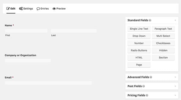
One of our favorite tools that we keep in our arsenal is Gravity Forms. It’s a WordPress plugin that can enhance your website. Gravity Forms has a Premium Version for WordPress that is a full-throttle contact form plugin that features a drag-and-drop interface, advanced notification routing, lead capture, and more. Gravity Forms is easy to use, and that is why we include it with every website we build.
Optimize Your Form Layout
We hope that you can use theses 7 tips to start optimizing your form layouts. With a practical layout and user-friendly design, you can continue the online conversation with your visitors, and get more feedback from your forms.
Have a question? Visit our Contact Form. You guessed it 😉 we use forms too! ?


